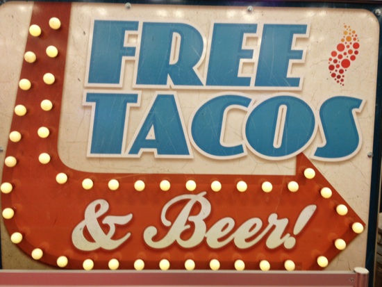
 The hallmark of great design, according to my good friend and long-time collaborator Jean Pierre Lacroix, President of Shikatani Lacroix Design, is that it must embody something he calls “The Blink Factor.” JP argues, quite persuasively I think, that a package must communicate in “the blink of an eye” to be effective. This is especially true for impulse purchases, on-shelf or online. Because that’s all you’ll get from a consumer. A fraction of a second to communicate what your product is, its brand personality, and to provide some kind of emotional foundation for why you should buy it.
In one form or another, The Blink Factor is always at work. More than influencing the bottle of wine or bag of snacks you’ll buy, It determines the headlines you’ll click on, the people you date and much more.
During a trip to New York last week (where I also had the pleasure of seeing JP and his family, in on an extended weekend holiday from Toronto) I experienced a brief, unexpected, “Blink Factor” moment of joy. I had parked myself in a Starbucks on that unseasonably cold March morning to kill some time before a meeting. When I settled in, I noticed the computer screen of the man sitting next to me.
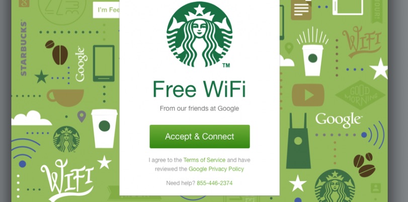
I can’t explain fully my reaction. Can free Wi-Fi at Starbucks even be described as a “small pleasure?” It’s something that’s expected by now – an entitlement. Starbucks is not my first choice in coffee houses, but their Google-powered Internet connection is absolutely the fastest and most reliable. So I suppose this rationale benefit quickly ladders up to feelings of welcoming, comfort and productivity.
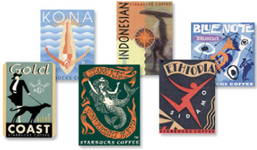
Or maybe I can trace the association back to my original visits to Starbucks, experiences that overwhelmed my senses of sight and smell. The latter speaks for itself – the aroma of freshly ground coffee beans is intoxicating. But I was also floored by the distinctive, detailed, colorful stickers they had designed to designate bean varieties.
All this got me thinking. What other “Blink of an Eye” visuals translate to a shot of instant happiness for me? Here are a few of mine, both past and present.
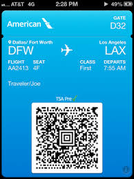
TSA pre-check! Yes! Shorter lines, no taking my shoes off, and the next best feeling to sitting in first class.
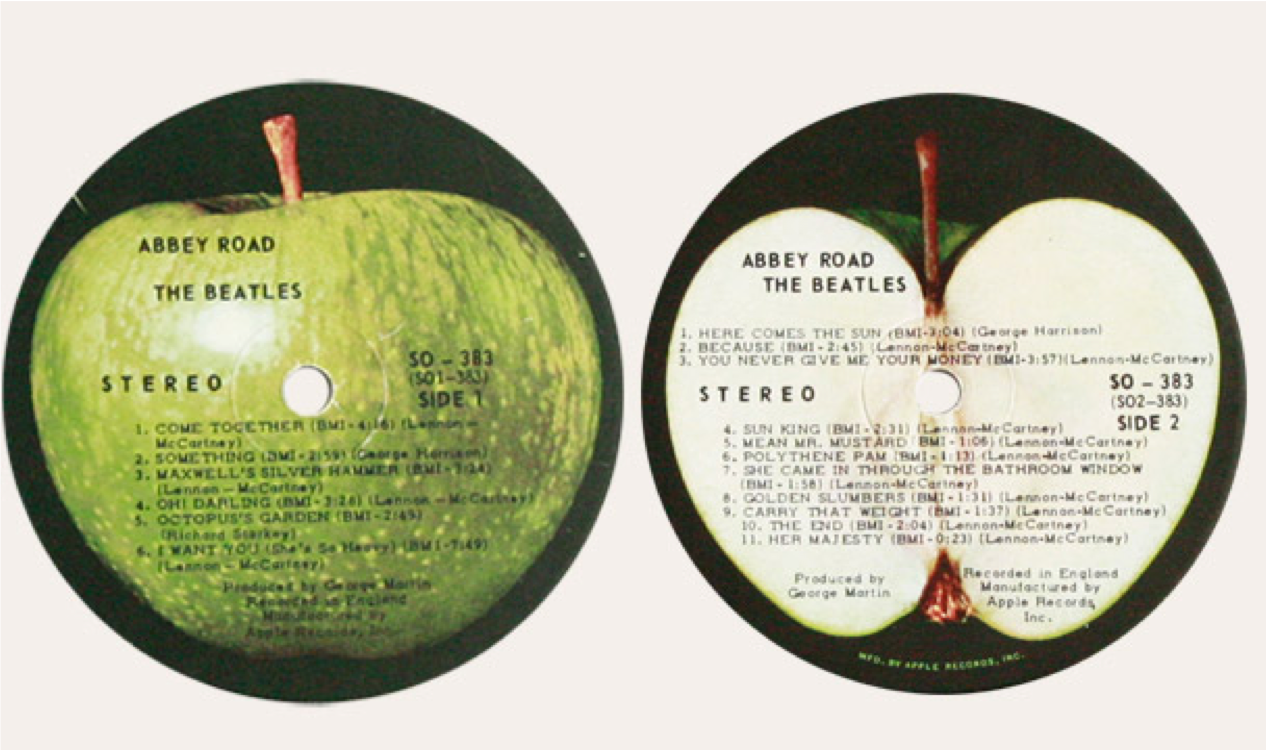
Before there was Apple there was Apple. Apple Records, that is, the creative company and recording label started by The Beatles. The band always understood the power of the visual (Beatle’s haircuts, suits, boots, logo, etc.) when they reaffirmed their iconic, pioneering status by incorporating the Apple logo into the design of their records in a way that hadn’t been done before.
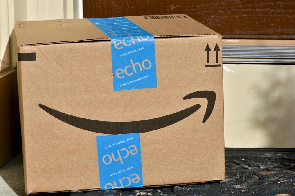
Is there anything better than coming home to a package from Amazon?
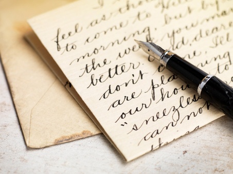
Speaking of getting things delivered, how about getting a real, hand written note from someone in the mail? What a novelty! Doesn’t that envelope stand out from the junk mail and make you feel special? When my grad students ask me for job hunting advice, I always tell them that the old-school, hand written thank you will truly make them stand out.
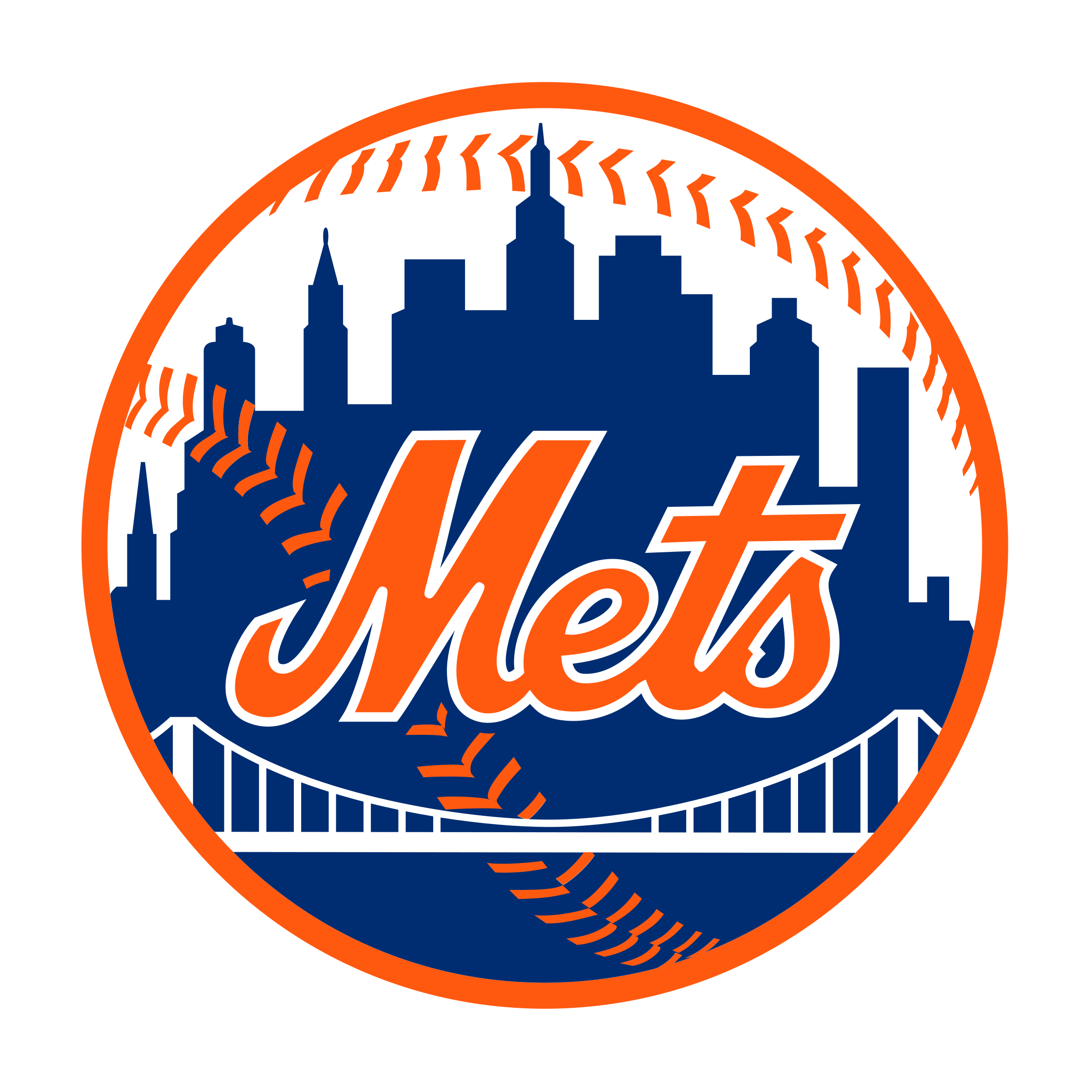
Baseball! Summertime! Long, lazy days! Now that I’ve lived in Los Angeles for 30 years I’ve finally started rooting for the Dodgers and the other home town teams. But there will always be a special place in my heart for the Amazin’ Mets and this logo. The Mets represented a return to National League baseball for New York after they city lost the Brooklyn Dodgers to L.A. and the New York Giants to San Francisco in 1962. So the Mets logo and uniforms combined Dodger Blue with Giant Orange in tribute to their predecessors.
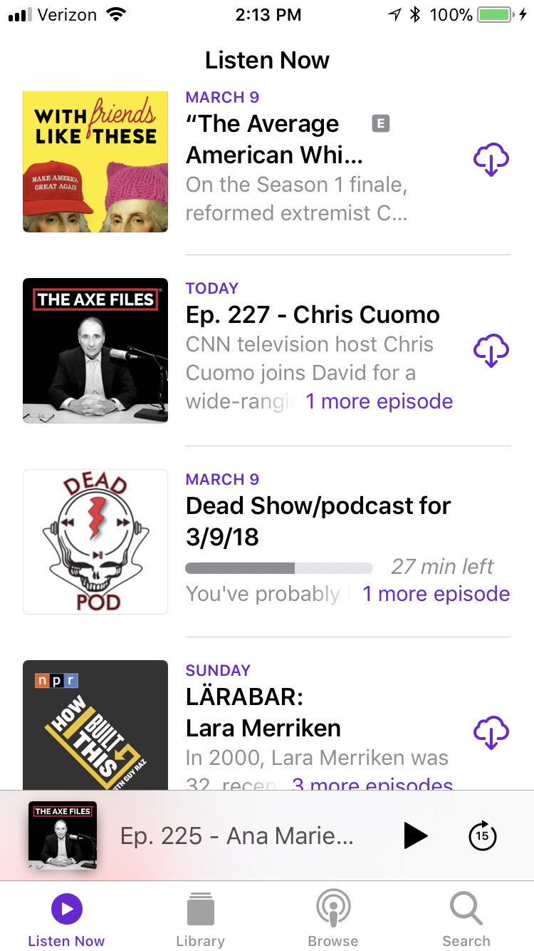
I love to click the podcast icon on my phone to see new episodes of my favorites pop up.
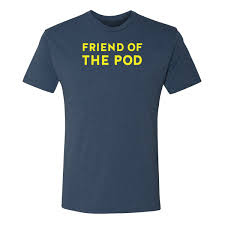
Pod Save America transports me to the liberal comfort zone and gives me hope. I’ve got this t-shirt myself. Spotting someone else in merch means an instant connection and makes me feel like an insider.
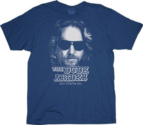
Recognition and insider status are at the heart of the badge value of t-shirts. Here’s another one I have. People approach me all the time when I have this on. The Dude puts us on the same wave-length. Careful man, there’s a beverage here!

The Fender brand has always leveraged the power of unique visuals. Their backwards F logo is instantly recognizable, as are the body shapes of its guitar models. Any of these images is rock & roll in the blink of an eye.
It seems that there’s a clear lesson in all of this. Marketers should spend more time, attention and money on visuals! (Call my friend JP!)
So what “Blink of the Eye” visuals make you feel good? I’d love to know!
