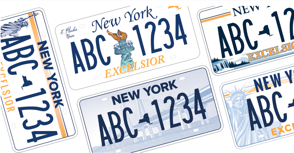
 The great state of New York, where I grew up, has left it to its citizens to decide on its next license plate. If only they had solicited designs from citizens rather than forcing them to choose from five nominally “professional” but dreadful alternatives.
Adweek solicited opinions from other design professionals who were not impressed either.
In addition to its functional role, the license plate is the most visible, and therefore most powerful, statement of branding from the states. Each of the New York alternatives incorporate one or more state icons, including the Statue of Liberty, Niagara Falls, the new Tappan Zee bridge, the Manhattan skyline and the shape of the state itself. Some also include the word “Excelsior,” the state motto, which translates to “Ever Upward” in Latin, and the phrase “E pluribus unum,” (Out of many, one), our national motto with no direct association to New York, as far as I know.
The New York plate proposals check the right content boxes for the most part, but I would argue that a new bridge, as impressive as it is, cannot supersede icons such as the Statue of Liberty, the New York City skyline or the Empire State Building
Niagara Falls? Not proprietary! That could easily go on Ontario license plates as well.
And what about the state’s nickname, “The Empire State?” It should be a contender. Far more familiar and easier to read and pronounce for most people than “Excelsior.” We also should not forget about “I Love New York,” the tagline from what could be best branding effort for a state ever, or “New York State of Mind,” from the Billy Joel song.
But content isn’t the big issue here. It’s design. License plate designs should fall into one of two categories, classic or bold and iconic. Some are able to combine the two. Here are some of my favorites in each category:
Classic Designs
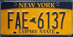
Why look for new designs when you have this? A, simple, elegant display of New York’s classic license plate colors, state shape and nickname. Beautiful.
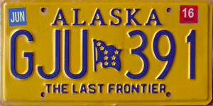
It doesn’t get better than Alaska. These aren’t seen often in the Lower 48, but are recognized instantly when they are. Two simple colors, the state name in large type, the state flag and motto. Clean, timeless and memorable.
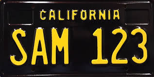
This throwback plate is not standard issue, but available at an extra cost. I have one of these myself. The yellow on black design is striking and evokes simpler times.
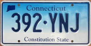

Simplicity is the guiding force behind Connecticut and New Jersey plates. Designs have evolved but the core colors remain the same.

Designers often talk about “owning” a color, something the aforementioned states have always done. Vermont, the Green Mountain State, always took it to the next level. And Vermont was green before green was a cause.
Iconic Designs
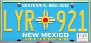
Hands down, New Mexico is the most beautiful of all plates, though not without controversy. The Zia symbol is sacred to its people, from which it has been appropriated. Still, the symbol against the turquoise background is stunning, with the design lending credibility to the state motto, “Land of Enchantment.”
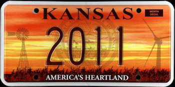
The state seal may not be necessary, but this beautiful depiction of Kansas’s wide open, agriculture spaces captures the down-to-earth feeling of “America’s Heartland.”
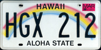
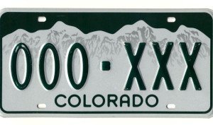
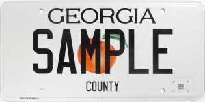
These states focus the single image that best represent them. Rainbows, Rocky Mountains and Georgia Peaches. Simple designs that brand these states in the blink of an eye.
Go Big, Go Young or Go Home
One of the biggest issues for me is that the five proposed designs don’t offer much of a range, design-wise. How about pushing the design envelope in a meaningful way? While New York is one of the original states with a very rich history, that doesn’t mean it needs to be stuck in the past. An infusion of youthful attitude and inspiration would be welcome.
Clearly, the proposed New York designs were developed by and/or directed by – how shall I say this diplomatically – old farts. They are safe and expected.
This is an exercise in branding and self-expression on the part of the state. New York State is an amazing place. Its millions of license plates, perhaps the most visible expression of its brand, need to reflect its glory.

