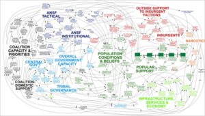
 The following piece was featured in a September 2009 newsletter. With today’s front page article in the New York Times, “We Have Met The Enemy And He Is PowerPoint,” it’s worth another look.
I have to admit, I never did like PowerPoint. This probably has its roots in elementary school, where I got A’s on everything with the exception of art class and penmanship. I still can’t draw and have trouble even signing my name (should have been a doctor!), so it’s no surprise that my PowerPoint skills were never well developed.
But I’m thinking that that isn’t such a bad thing. It took me a long time to hone my writing skills, where I aspire to clear communication with actionable recommendations based on real consumer insight. While I believe fervently in the power of visuals to communicate, it seems to me that PowerPoint is all too often used as a crutch. As David Ogilvy put it, research should be not be used as a drunk uses a lamppost – for illumination, not for support. The same goes for PowerPoint.
The business culture often reflects our impatient society at large, as we seek immediate gratification and are unwilling to accept the ambiguity inherent in making decisions. But many PowerPoint presentations that seem to be impressive at first blush are simply a collection of clichéd pick up art from the Web and incomprehensible diagrams and flow charts.
Just as the ranks of musicians and artists proliferated when the Mac arrived on the scene, and then the PC when it caught up, making creativity “easy” and “accessible,” PowerPoint became a crutch for business people with nothing to say to provide the appearance of looking smart. We all like to complain about lawyers who have developed a language all their own to keep us mere mortals in confused and in awe, but we are no better.
Simply put, bullet points will never replace prose for analysis. PowerPoint can be a great tool for presentations when well executed, but how often is PowerPoint used in place of written reports?
McKinsey was among the first in PowerPoint “innovation,” taking complex information and cramming everything but the kitchen sink into a limited number of slides. Knowing how the watch works can be very impressive, but I’d rather tell time.
This shorthand disease has spread like a virus into the mainstream. Too often, we see PowerPoint reports blending the ridiculously obvious with so much visual information that they are rendered nearly worthless. Those of us in the marketing and communications business owe it to our clients and ourselves to be more thoughtful, eloquent and precise.
Lists of bullet points with visuals are seldom a viable substitute for descriptive prose. Along with PowerPoint, text messages, Tweets and rushed emails short attention spans are only growing shorter. But in world of increasing emotional complexity and economic hardship, the depth and power of well written prose are more essential than ever.
These points are beautifully illustrated by Edwin Tuffte, an artist and professor at Yale in his original “PowerPoint is Evil” tract, first published in September 2003, and Peter Norvig’s brilliant recreation of Lincoln’s Gettysburg Address as a PowerPoint.
Click on these links to see their work.


